Editorial Design
Book Redesign
Book Redesign was completed as a course project during my Bachelor's studies in Visual Communication Design at Aalto University. The assignment was to redesign an existing book and create a new visual interpretation of its content, changing how the book is perceived by the reader. For this project, I chose Blood and Guts by Dorian Yates, a bodybuilding book originally published in 1993. Yates is known as one of the most influential Mr. Olympia champions, and his training philosophy is often described as intense and hardcore. I wanted the redesign to reflect this energy more strongly than the original visual identity of the book.
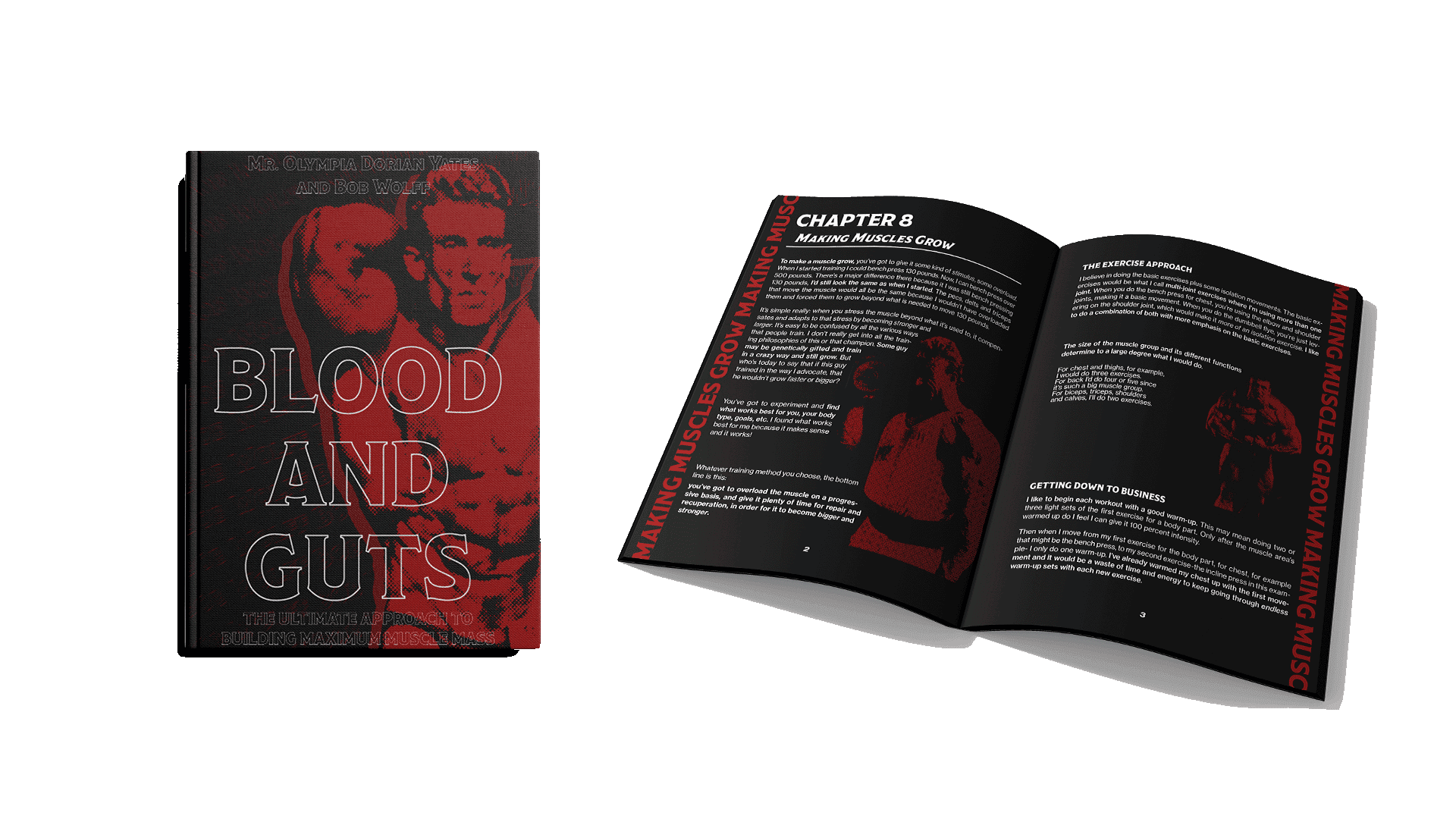
Note: Interior page layouts have been omitted from this portfolio to respect the original publisher's copyright.
Year
2025
Category
Editorial Design, Typography, Book Design
Project Type
Coursework, Individual project
Course
Editorial Design & Typography, Aalto University
My Role
Concept development, typography, layout design, cover design, book binding, and final book mockups.
Tools
Adobe InDesign, Photoshop, Illustrator, Book Binding Tools
Project Overview
This book redesign was completed as a course project during my Bachelor's studies in Visual Communication Design at Aalto University. The assignment was to redesign an existing book and create a new visual interpretation of its content, changing how the book is perceived by the reader.
I chose Blood and Guts by Dorian Yates, a bodybuilding book originally published in 1993. Yates is known as one of the most influential Mr. Olympia champions, and his training philosophy is often described as intense, uncompromising, and hardcore. I wanted the redesign to reflect this energy more strongly than the original visual identity of the book.
Design Direction
The original book used rounded, block-like typography and a softer color palette with yellow, reddish orange, and blue. In my opinion, this visual style did not fully communicate the intensity of the book's subject matter or the atmosphere of Yates' training philosophy.
My redesign takes a more direct and powerful approach. I used a bold black and red color palette, strong contrast, and heavier typography to create a visual language that feels raw, physical, and intense. The goal was to capture the energy of high-level bodybuilding and communicate the discipline, aggression, and focus connected to the sport.
Process and Details
The design process included research into bodybuilding culture, gym aesthetics, and visual references connected to strength, performance, and physical intensity. I explored how typography, contrast, layout, and pacing could be used to create a stronger reading experience and a clearer connection to the book's content.
One of the most important design details was the use of chapter titles along the sides of the pages. This choice was both visual and functional: it adds rhythm to the layout while making it easier for the reader to navigate the book and find specific sections.
Overall, the redesign aimed to honor the culture of bodybuilding while making the book feel more visually aligned with its message. I wanted the final result to feel bold and intense, but still functional as a readable and navigable book.
Bookbinding and Craft
In addition to the visual redesign, the course also introduced bookmaking as a physical craft. I took part in a graphic design bookbinding workshop, where I learned how to prepare, assemble, and bind the final book by hand.
This part of the process helped me understand the book not only as a visual layout, but also as a physical object. Decisions such as page order, margins, pacing, cover construction, and binding affected how the final piece would be handled and experienced by the reader.
Binding the book myself made the project more complete and gave me a stronger understanding of editorial design as both a digital and material process. The final outcome was not only a redesign on screen, but a finished physical book.