Visual Identity
KULMA136 Visual Identity

Visual identity proposal for a youth center project, developed in 2025 as part of a client brief during a course at Aalto University.
Jump to visualsYear
2025
Category
Visual Identity, Branding, Motion Design, Graphic Design
Project Type
Team project, client brief, coursework
Team
Cecilia Lindgren, Heidi Cantell, Anna Ihamuotila and Eevi Kaila
My Role
Graphic Design: Visual identity, typography, layout design, and social media branding. Motion Design: Social media showcase video and color palette showcase video.
Tools
Adobe Illustrator, Photoshop, After Effects, InDesign, PowerPoint
Design Process
The design process included on-site location research, community research, concept development, visual exploration, and refinement of the identity system. As a team, we explored how the youth center could be represented as an inviting, exciting, and meaningful place for young people.
Our process began by identifying three key questions: how can we connect multiple user groups under one identity, how can the identity reflect the Havukoski area, and how can we create an identity that stands out and feels relevant to young people? These questions guided our research toward the target audience: the youth.
We visited the area, observed the local environment, and benchmarked visual styles, spaces, and brands that appeal to young people. Through this research, we defined the main qualities that would guide the identity: bold, energetic, inviting, cozy, and playful.
Final Identity
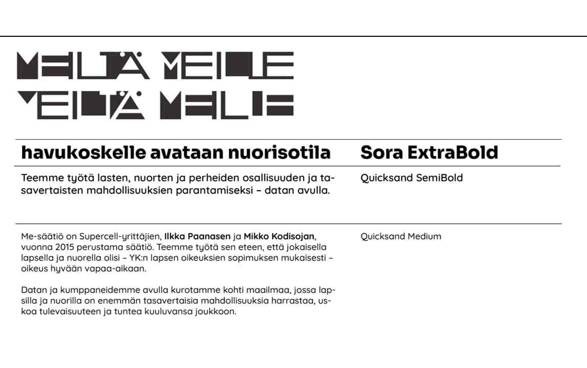
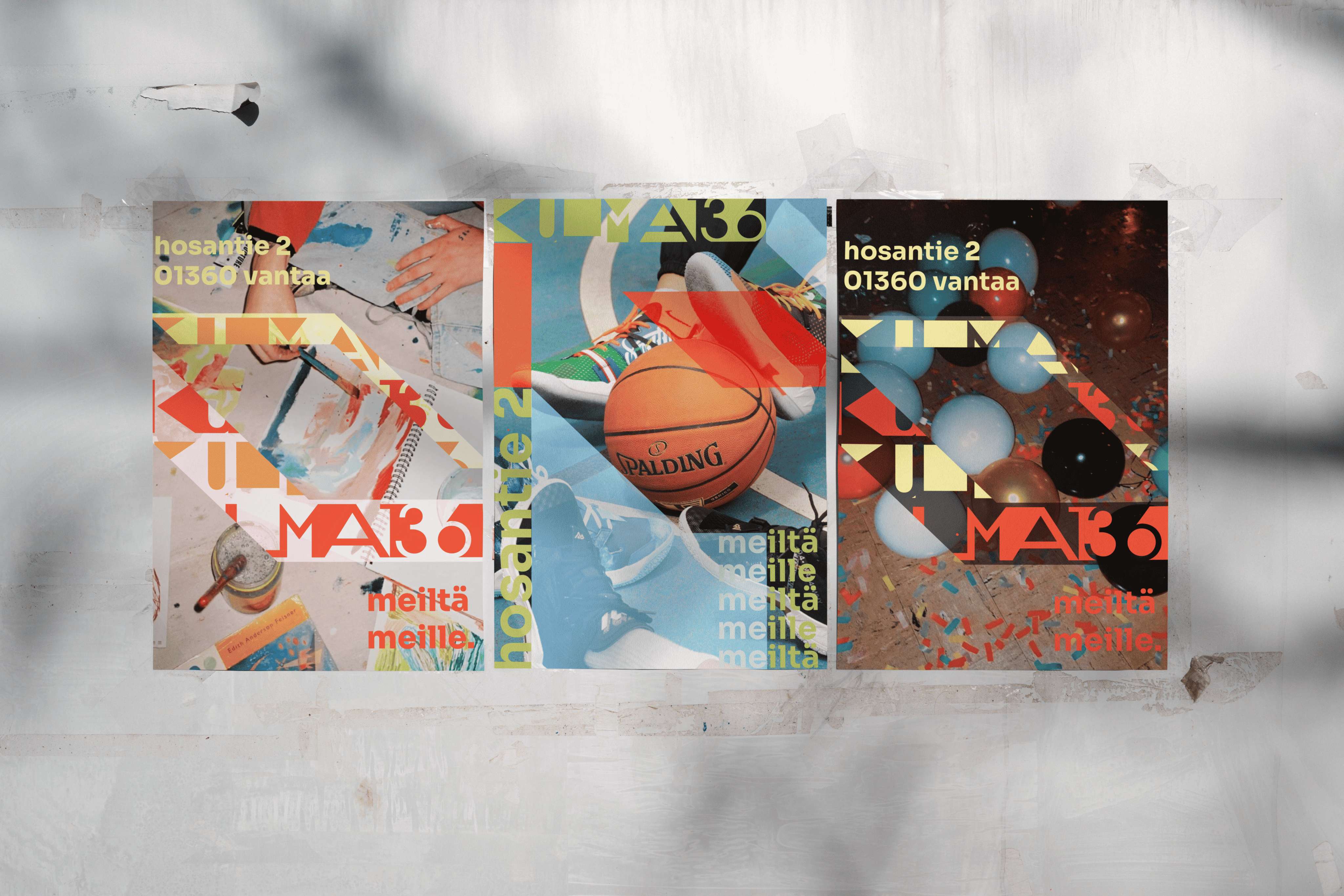
The final identity concept, KULMA136 - Meiltä meille, was designed to feel bold, flexible, and youth-oriented. The logo features sharp, graphic forms that can be used both in black and white and with the identity's own color palette.
The visual language is inspired by the architectural characteristics of the youth center building, especially its sharp concrete edges and angular forms. These elements were translated into a playful and versatile graphic system that can be adapted across different materials and formats.
The color palette was designed to respond to different needs and moods within the youth center. Some colors create a calm and cozy atmosphere, while others bring energy, contrast, and boldness to the identity.
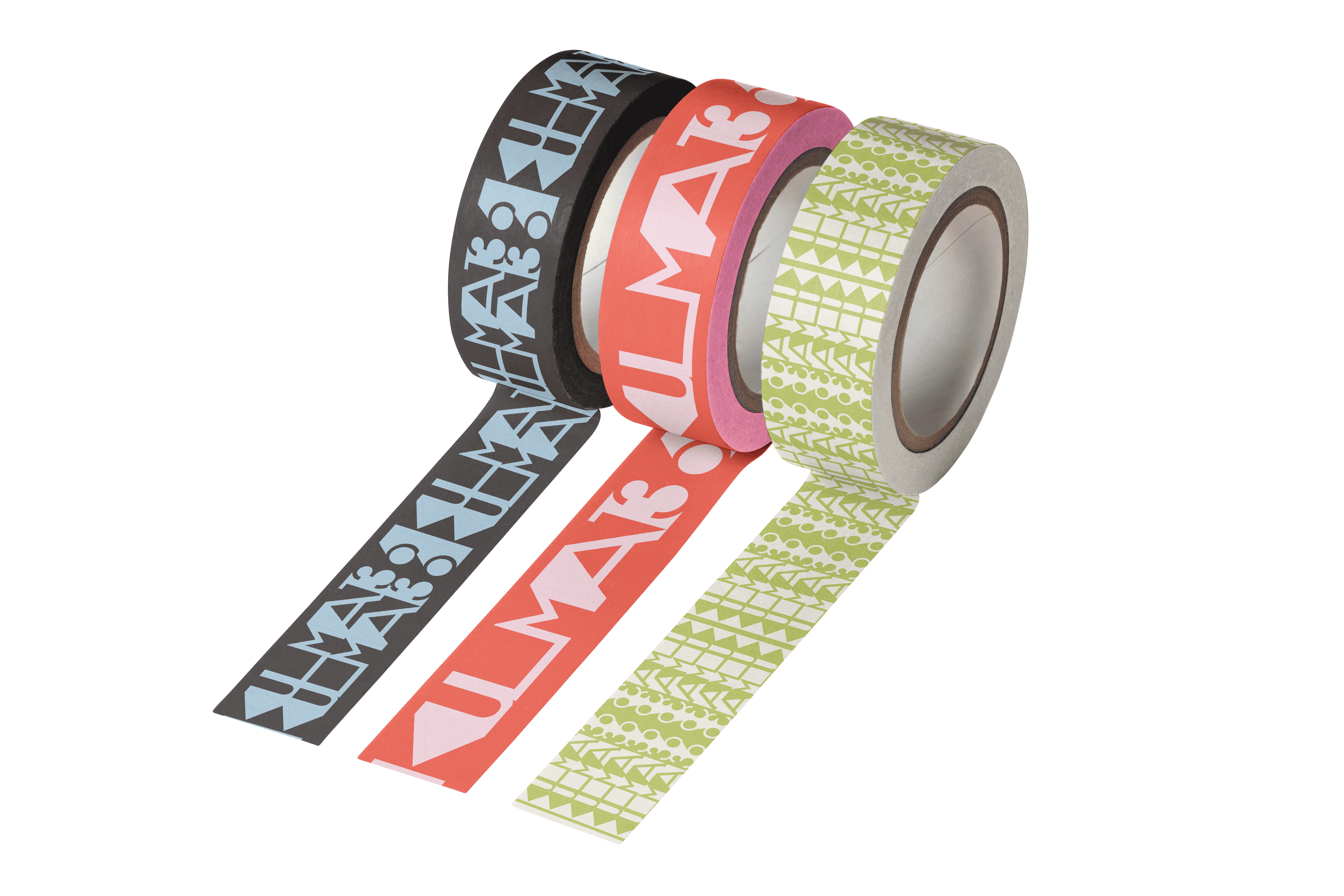
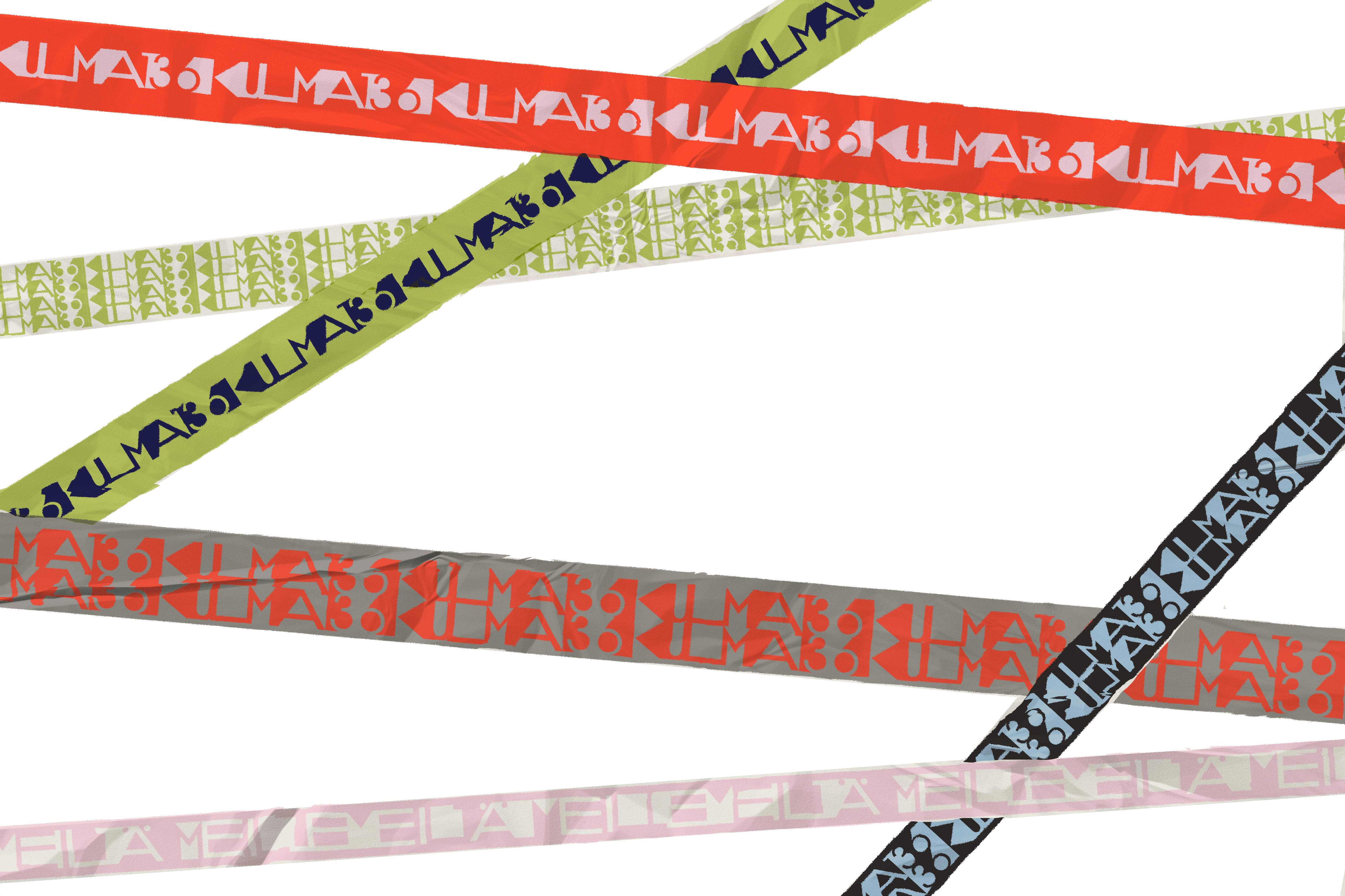
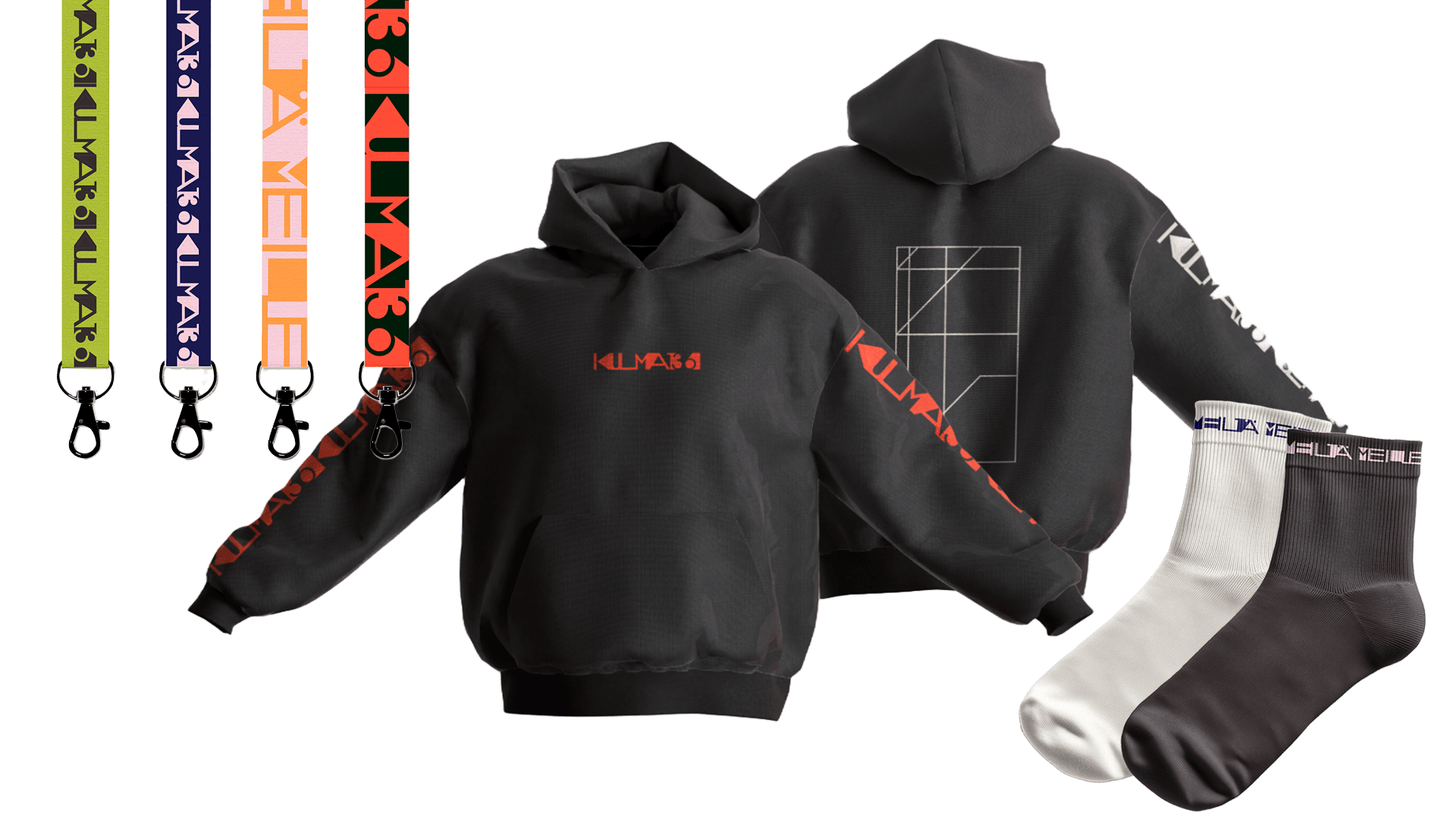
Our design proposal included applications such as poster design, social media branding, spatial design, and merchandise. One of the more playful details was the tape design, which was created for the space itself. The tape could be used by young people to create shapes, mark areas, decorate surfaces, or build their own visual expressions within the youth center.
My Role
My role in the project focused mainly on graphic design and motion design. I worked on the visual identity, typography, layout design, social media branding, social media showcase video, and color palette showcase video.